Transferring handwriting skills from worksheets to paper 

At Teach Handwriting our aim is to move children off of worksheets as soon as possible. To achieve this, it is important to encourage them to transfer their skills to plain or lined paper whichever is most appropriate to their ability level. We realise that it is not always possible to buy paper with the appropriate line height in all cases, so would recommend creating your own on the computer.

  • Use a combination of worksheets and lined paper in each handwriting session with your child:
    1. Use the colour worksheet, or a grey scale version, and complete one or two rows.
    2. Then encourage the child to try the same patterns or letters on appropriately lined paper, again try one or two rows only.

Hopefully the worksheet will last over a couple of handwriting sessions and you and the child will see an improvement over the time. The sooner they learn to transfer their skills to paper the better.

We realise that printing off our worksheets and coloured lined paper can become costly so, to help reduce the costs:

  • Use a colour version of the appropriate worksheet initially and then try printing in grey scale. Children usually make the adjustment to grey scale well once they are used to how the picture clues and colours work.
  • You could also use the grey scale worksheets and colour the start of each row with the appropriate colour.

The Second Stage to #Handwriting Success – Single Letter Formation

https://teachhandwriting.co.uk/letter-animations-worksheets.html

Last week we explained that pre-handwriting patterns are the first stage of learning to handwrite. Once a child has mastered theses, they are ready to start learning how to form letters.

But where do you start?

Our view is to focus on lower-case letters first and only the capital letters for the first letter in a child’s, examples: Peter Rabbit, Sally Green, George Blue or Mary Shell.

Why?

  • One reason is that about 95% of what children write, and are exposed to, is in a lower-case form and only 5% in capital.
  • Lower-case letters are far less complicated, requiring fewer pencil lifts to complete the letters.
  • As both lower-case and capital letters require a child to form curved lines, a skill which most children have to practise, writing lower-case letters is no more difficult than writing capitals.
  • In a young child’s writing all the letters are initially the same size, whether they are capitals or lower case; it is part of the normal developmental path of handwriting. So, the view that teaching capitals letters is easier because they are bigger is not true.
  • Young children who have learnt mostly capital letters first find it difficult to stop, as it is so ingrained into the memory, often using them half way through words and sentences. Even when they are older this inappropriate use of capitals creeps back into their work especially if they are tired or concentrating hard on composing their work.

A child’s first major achievement, in their eyes, is to write their name. So, although concentrating on lower-case letters, teach them how to form the capital letter for the first letters of their name to get them excited about handwriting.

As they master the lower-case letters introduce the remainder of the capital letters. It is important that both are taught so that a child can develop a speedy, fluid and legible handwriting style.

Free Letter Formation Animations & Worksheets: http://bit.ly/2F9P7cI

Transferring handwriting skills from worksheets to paper

Worksheet Colours 2

At Teach Handwriting our aim is to move children off of worksheets as soon as possible. To achieve this, it is important to encourage them to transfer their skills to plain or lined paper whichever is most appropriate to their ability level. We realise that it is not always possible to buy paper with the appropriate line height in all cases, so would recommend creating your own on the computer.

  • Use a combination of worksheets and lined paper in each handwriting session with your child:
  1. Use the colour worksheet, or a grey scale version, and complete one or two rows.
  2. Then encourage the child to try the same patterns or letters on appropriately lined paper, again try one or two rows only.

Hopefully the worksheet will last over a couple of handwriting sessions and you and the child will see an improvement over the time. The sooner they learn to transfer their skills to paper the better.

We realise that printing off our worksheets and coloured lined paper can become costly so, to help reduce the costs:

  • Use a colour version of the appropriate worksheet initially and then try printing in grey scale. Children usually make the adjustment to grey scale well once they are used to how the picture clues and colours work.
  • You could also use the grey scale worksheets and colour the start of each row with the appropriate colour.

The Second Stage to Handwriting Success – Single Letter Formation

Letter Formation 2

Last week we explained that pre-handwriting patterns are the first stage of learning to handwrite. Once a child has mastered theses, they are ready to start learning how to form letters.

But where do you start?

Our view is to focus on lower-case letters first and only the capital letters for the first letter in a child’s, examples: Peter Rabbit, Sally Green, George Blue or Mary Shell.

Why?

  • One reason is that about 95% of what children write, and are exposed to, is in a lower-case form and only 5% in capital.
  • Lower-case letters are far less complicated, requiring fewer pencil lifts to complete the letters.
  • As both lower-case and capital letters require a child to form curved lines, a skill which most children have to practise, writing lower-case letters is no more difficult than writing capitals.
  • In a young child’s writing all the letters are initially the same size, whether they are capitals or lower case; it is part of the normal developmental path of handwriting. So, the view that teaching capitals letters is easier because they are bigger is not true.
  • Young children who have learnt mostly capital letters first find it difficult to stop, as it is so ingrained into the memory, often using them half way through words and sentences. Even when they are older this inappropriate use of capitals creeps back into their work especially if they are tired or concentrating hard on composing their work.

A child’s first major achievement, in their eyes, is to write their name. So, although concentrating on lower-case letters, teach them how to form the capital letter for the first letters of their name to get them excited about handwriting.

As they master the lower-case letters introduce the remainder of the capital letters. It is important that both are taught so that a child can develop a speedy, fluid and legible handwriting style.

Free Letter Formation Animations & Worksheets: http://bit.ly/2F9P7cI

The First Stage to Handwriting Success – Pre-handwriting Patterns

Pre-handwriting Patterns 1

Pre-handwriting patterns are the first stage in supporting a child to handwriting success. They help the child to learn the shapes and directional pushes and pulls required to form letters. All letters are a combination of these shapes and lines.

Young children can start to learn these patterns through their play, long before they are ready to pick up a pencil, moving toys back and forth across the floor or whirling them around in the air. To a child it is just play and fun, but you are doing something far more powerful and constructive by helping them to develop the motor memory patterns and directional movement skills they will need for handwriting.

Later, as their coordination and gross motor skills develop, they make more controlled and varied movement patterns in their play. Changing directions, speed and size are all prerequisite skills needed for learning pre-handwriting patterns.

These handwriting patterns do not need to be taught as worksheet activities (though they do help to perfect shape and pattern formation), drawing pictures and patterns in sand, paint and with other writing tools are all fun ways to practise.

Teaching the handwriting patterns in groups helps to further develop the specific movements (pushes and pulls) required to form them and help commit them to the motor memory. A child can then recall these motor memories to support them as they begin to form letters.

Pre-handwriting patterns that encourage a child to move their pencil from left to right are very important for left-handed writers. They need to be taught this so that they can make the cross motion in the H, T, J, G and I from left to right, as their natural instinct is to go from right to left. If this is not corrected when writing E and F the cross lines will not be “anchored” to the letter.

Once the handwriting patterns have been mastered a child will have the confidence and skills base necessary to start forming letters, numbers and symbols.

Have you got your Free Pre- handwriting Pattern Animations & Worksheets? http://bit.ly/1yibFhm

Is it a cursive or continuous cursive handwriting font?

CC & Cursive 1

Looking at a few different school websites and queries from parents this week we found that some think that Cursive is just short for Continuous Cursive. In fact, they are two different handwriting font styles:

Cursive:

Cursive a Cloud

https://www.teachhandwriting.co.uk/cursive-beginners-letter-choices.html   


  • The letters start at different points (the same as print letters).
  • The finishing points for all the letters is at the writing line (with a small exit stroke); except for, o, r, v and w, which have a top exit stroke.
  • The single letter formations are taught with just the exit strokes.
  • When cursive is joined the first letter in the word does not have an entry stroke for example:

Curive Rock

https://www.teachhandwriting.co.uk/cursive-joins-letter-choices.html


Continuous Cursive

httpsCC a Cloud://www.teachhandwriting.co.uk/continuous-cursive-beginners-letter-choices.html                                            


  • The starting point for all the letters is the same; on the writing line.
  • The finishing points for all the letters is also at the writing line; except for, o, r, v and w, which have a top exit stroke.
  • The single letter formations are taught with the entry and exit strokes, this makes the transition from single letter formation to joined handwriting very straightforward and allows it to occur sooner.
  • When continuous cursive is joined the first letter in the word has an entry stroke for example:

CC Rock

https://www.teachhandwriting.co.uk/continuous-cursive-joins-letter-choices.html


 Be aware, some schools will say they are teaching a Cursive font when in fact they are teaching a Continuous Cursive font.

Teaching Letter Joins – A Systematic Approach

Joins twitter

We would recommend teaching joins in join type groups, whether your child has learnt cursive or continuous cursive single letter fonts.

Teaching the join types in their groups helps a child to understand the directional pushes and pulls required to successfully join the different letter combinations.

There are 4 main groups of letter joins; bottom joins, bottom to “c” shape joins, “e” joins (top and bottom join strokes) and top joins.

Moving from Cursive Single Letters to Joining

There are seven join strokes to be taught. Most children will find the bottom joins the easiest to achieve, as it only requires the extension of the exit stroke they already put on the letters. The bottom to “c” shape joins can be tricky at first but soon mastered. The joins that tend to cause the most confusion and difficulty are the “e” joiners and top exit joiners.

I would recommend teaching the bottom joins first, then the ‘e’ joins and finally the top exit letter joins.

Moving from Continuous Cursive Single Letters to Joining

There are three join strokes to be taught. The easiest is the bottom exit letters (the majority of the letters), all a child has to do is write the letters closer together without lifting their pencil off the paper. Only the top to “e” and top joiners need to be taught for continuous cursive, as the nature of the font style means that the lead-in and exit strokes needed to join the majority of letter combinations have already been taught.

I would recommend teaching the bottom joins first, then the top exit to ‘e’ join and finally the top exit letter joins.

For our free join animations and worksheets: http://bit.ly/2F9P7cI

For tips to support the teaching of joins check out our Teaching Tips section:  http://bit.ly/2AaX8sk 

Handwriting Teaching Routes and Letter fonts

Handwriting animation page

The website design has been up for two weeks now and we hope that you are finding your way around OK.

Over the next few weeks we will be guiding you through some of the new changes. All the animations, worksheets, games, activities and support information that was on the old website design is still in the new one with some new elements and most importantly is still FREE for all to use on a non-commercial basis.

Teaching Routes

To support schools and the parents of children whose school use the website to teach their children, we have organised the animations and worksheets into our 4 main Teaching Routes. These are based on the most common teaching routes (approaches) used in schools to teach handwriting.

We refer to these as Teaching Routes A, B, C and D. The teaching route used by a school will depend on which letter font they will introduce in Foundation Stage (4 – 5 year olds) and then teach in Key Stage 1 (5 – 7 year olds).

More information on the Teaching Routes for handwriting can be found in our Handwriting Letters Fonts section: http://bit.ly/2RFlHEN

Letter Fonts

There are four main font styles taught in UK schools; manuscript capital letters, manuscript print (sometimes referred to as the ball and stick method), cursive and continuous cursive.

The capital letter and print letters in the UK have a standard letter shape and formation for each of the 26 letters of the alphabet. However, this is not the case for cursive and continuous cursive letter fonts.

For the Teach Handwriting Website and The Teaching Handwriting Scheme for schools (if purchased) we have standardized 23 of the letters in the cursive and continuous cursive fonts and offer different versions for the letters w, x and z.

The letter version chosen dictates which letter family (teaching groups) they belong in. This is why we have the Letter Versions 1, 2, 3 and 4. In each letter version all the letters and worksheets are in the appropriate letter families.

More information on the Letter Versions for handwriting can be found in our Handwriting Letters Fonts section: http://bit.ly/2RFlHEN

Get your free animations and worksheets for all our fonts letters and numbers by clicking through to the Handwriting animations and worksheets page on our website: http://bit.ly/2F9P7cI

The Best Type of Paper for Teaching Handwriting

Just as the writing tool used by children changes as they develop, so does the paper they write on.

Informal Pre-handwriting Pattern and Initial Letter Development

If your child is just starting out on the handwriting adventure then any type of plain paper (no ruled lines) is considered the best option, as many children find it less restrictive.

Young children, due to the stage of their physical development, use large movements to draw (from the shoulder rather than the wrist) which often creates larger shapes and lines; you don’t want to restrict this movement as it can cause handwriting difficulties later. As their gross and fine motor skills develop so does their pencil grip and ability to draw and write at a smaller scale, moving more from the shoulder to elbow and wrist.

Formal Pre-handwriting Pattern and Letter Development

When your child is ready to refine their pre-handwriting pattern skills, or move on to forming letters, it is a good idea to use plain paper. The aim at this stage is to learn how to form the letters correctly, not size or neatness as that comes later.

Before moving to lined paper, to help children to start to appreciate the letter proportions and positioning, paper with picture clues can be used.

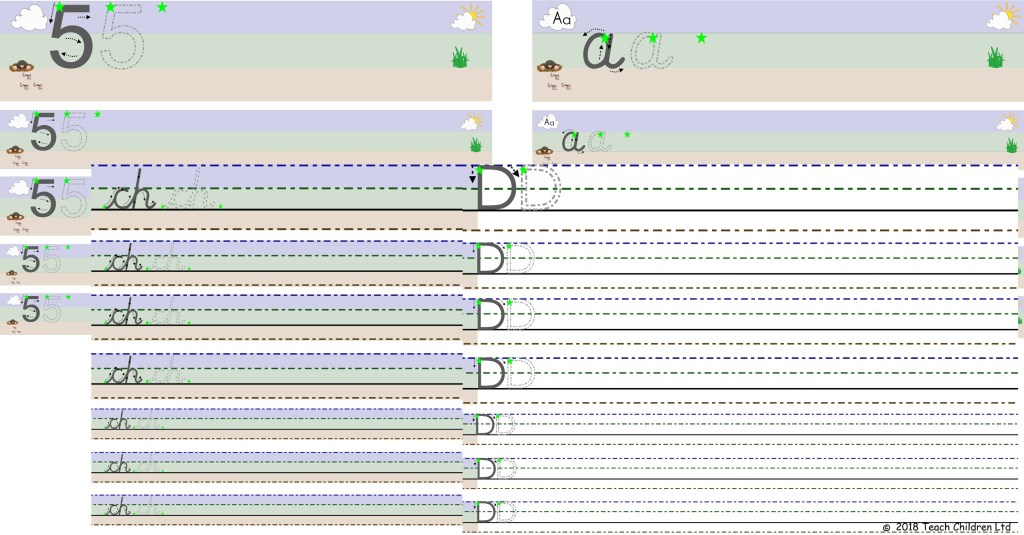
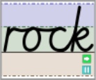
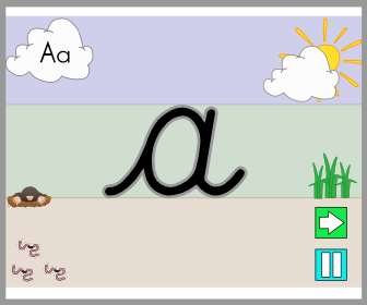
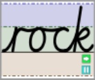
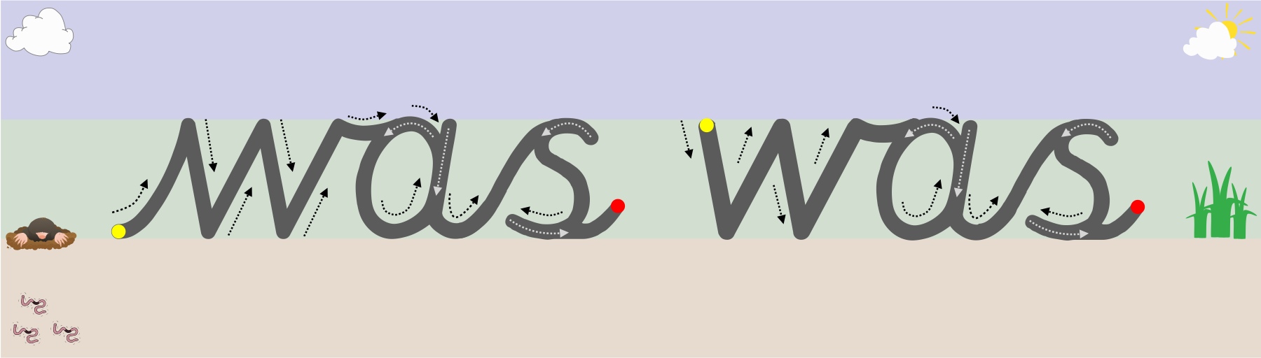
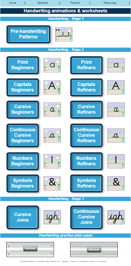
On our website the free writing paper and animations reinforce the idea of letter proportions and positioning by splitting the backgrounds into three colour zones to represent the sky, grass and earth. There are a number of reasons why this can be beneficial:

  • It can create a sub-conscious memory in a child’s mind of where particular letters sit in relation to others without the constraints of lines or obvious boundaries, especially as the picture can be any size. Children remember where to place the sun, grass or worms in their drawings; so why not letters?
  • It can be easier to talk through the formation of how a shape or letter is formed with pictorial and colour clues to guide and inform the direction of the movements required.
  • As a child’s fine motor skills develop so the size of the picture/colour clues can be reduced to match their progress.

As a child’s fine motor skills develop it enables them to form smaller more refined versions of the letters and this is when it is more appropriate to use lined paper.

Transferring their handwriting skills from worksheets to paper 

The aim is to try and move children off the worksheets as soon as possible by encouraging them to transfer their skills to plain or lined paper which is appropriate for their ability. I realise that it is not possible to buy paper with the appropriate line height in all cases, so would recommend creating your own on the computer.

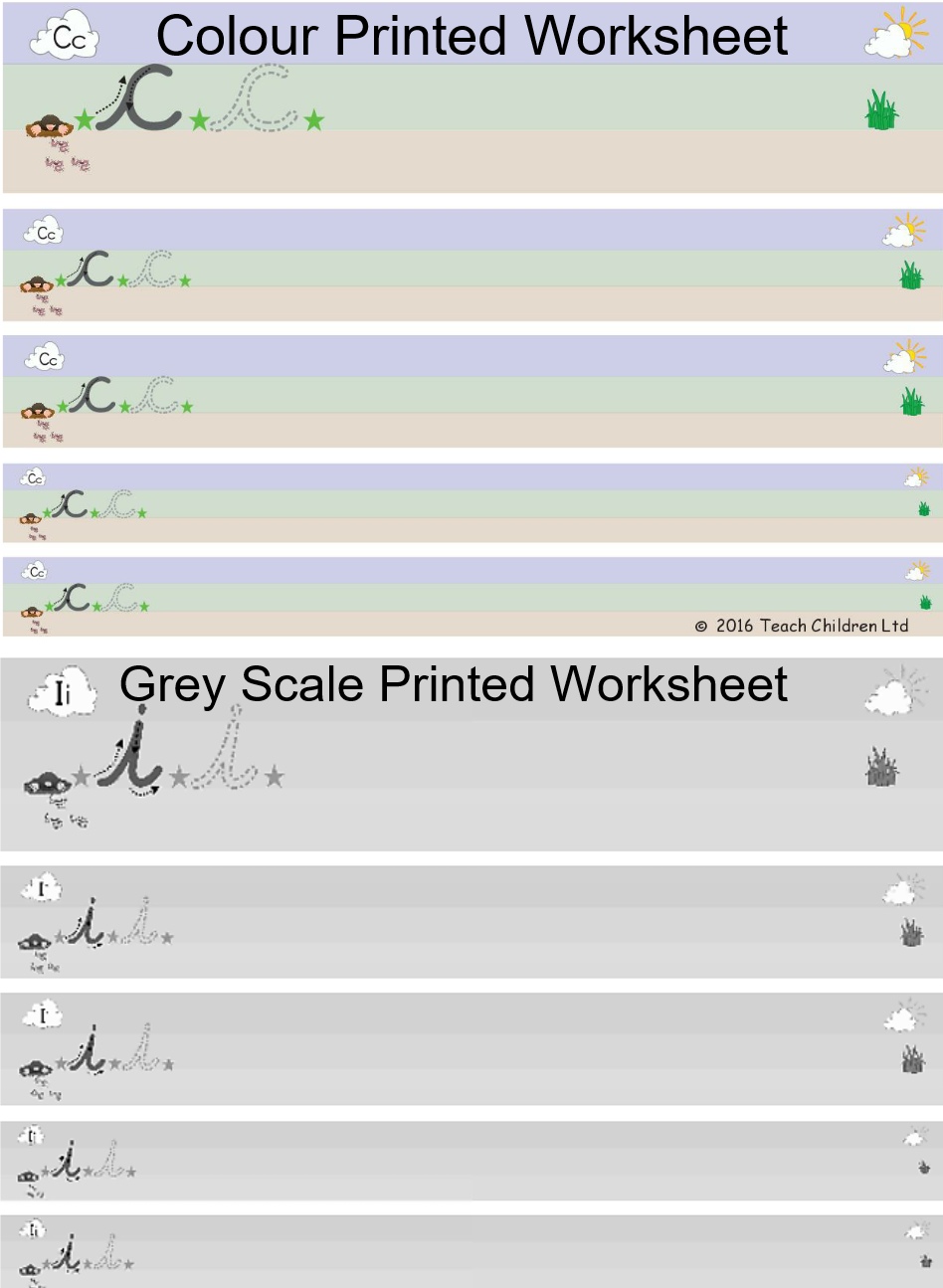
We realise that printing off our worksheets and coloured lined paper can become costly so, here are our recommendations for helping to reduce the costs:

  • Suggestion 1 – Use a colour version of the appropriate worksheet initially and then try printing in grey scale. Children usually make the adjustment to grey scale well once they are used to how the picture clues and colours work. You could also use the grey scale worksheets and colour the start of each row with the appropriate colour.
  • Suggestion 2 – Use a combination of worksheets and lined paper in each handwriting session with a child:
  1. Use the colour worksheet, or a grey scale version, and complete one or two rows.
  2. Then encourage the child to try the same patterns or letters on appropriately lined paper, again try one or two rows only.


Hopefully the worksheet will last over a couple of handwriting sessions and you and the child will see an improvement over the time. The sooner they learn to transfer their skills to paper the better.

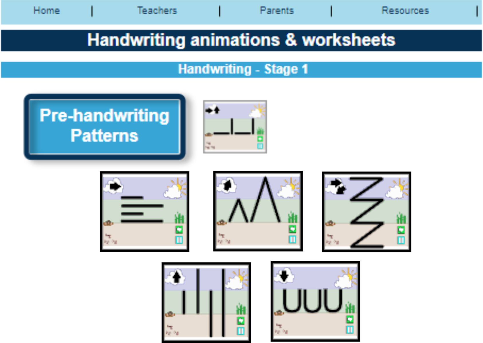
For different types of pre-handwriting pattern and letter formation paper go to our animations and worksheet page and scroll down to the end of the page: http://bit.ly/1PKXB46

Which to Teach First: Capital or Lower-Case Letters?

Once a child has mastered pre-handwriting patterns they are ready to start learning how to form letters, numbers and symbols.

But where do you start?

Our personal view would be to focus on lower-case letters.

Why?

  • One reason is that about 95% of what children write, and are exposed to, is in a lower-case form and only 5% in capital.
  • Lower-case letters are far less complicated, requiring fewer pencil lifts to complete the letters.
  • As both lower-case and capital letters require a child to form curved lines, a skill which most children have to practise, writing lower-case letters is no more difficult than writing capitals.
  • In a young child’s writing all the letters are initially the same size, whether they are capitals or lower case; it is part of the normal developmental path of handwriting. So the view that teaching capitals letters is easier because they are bigger is not true.
  • Young children who have learnt mostly capital letters first find it difficult to stop, as it is so ingrained into the memory, often using them half way through words and sentences. Even when they are older this inappropriate use of capitals creeps back into their work especially if they are tired or concentrating hard on composing their work.

A child’s first major achievement, in their eyes, is to write their name. So, although concentrating on lower-case letters, teach them how to form the capital letter of their name to get them excited about handwriting.

As they master the lower-case letters introduce the remainder of the capital letters. It is important that both are taught so that a child can develop a speedy, fluid and legible handwriting style.

Free Letter Formation Animations & Worksheets: http://bit.ly/1dqBYFm