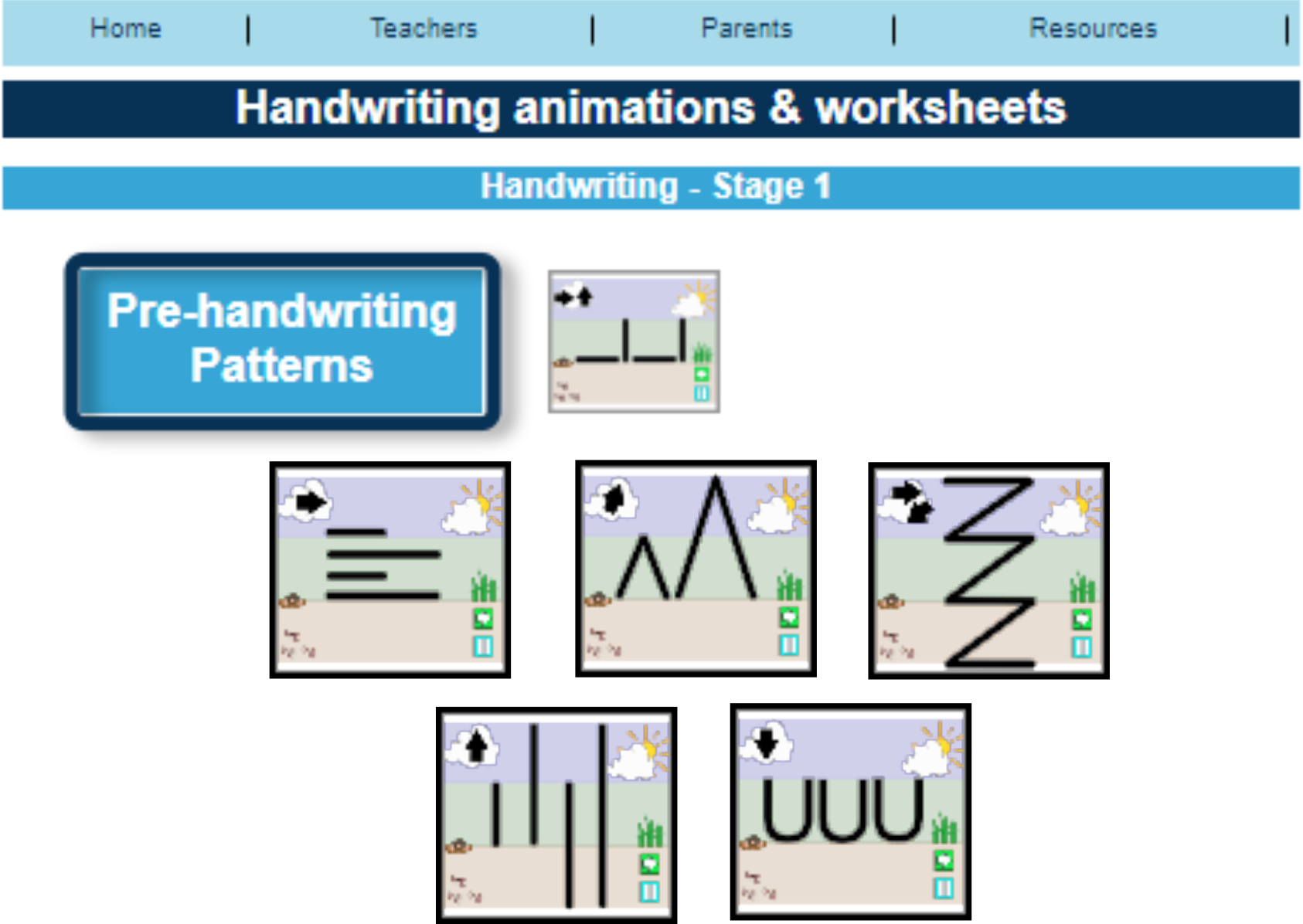
Last week we explained that pre-handwriting patterns are the first stage of learning to handwrite. Once a child has mastered theses, they are ready to start learning how to form letters.
But where do you start?
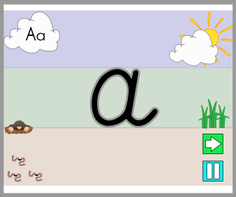
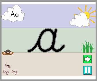
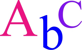
Our view is to focus on lower-case letters first and only the capital letters for the first letter in a child’s, examples: Peter Rabbit, Sally Green, George Blue or Mary Shell.
Why?
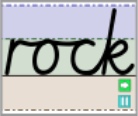
- One reason is that about 95% of what children write, and are exposed to, is in a lower-case form and only 5% in capital.
- Lower-case letters are far less complicated, requiring fewer pencil lifts to complete the letters.
- As both lower-case and capital letters require a child to form curved lines, a skill which most children have to practise, writing lower-case letters is no more difficult than writing capitals.
- In a young child’s writing all the letters are initially the same size, whether they are capitals or lower case; it is part of the normal developmental path of handwriting. So, the view that teaching capitals letters is easier because they are bigger is not true.
- Young children who have learnt mostly capital letters first find it difficult to stop, as it is so ingrained into the memory, often using them half way through words and sentences. Even when they are older this inappropriate use of capitals creeps back into their work especially if they are tired or concentrating hard on composing their work.
A child’s first major achievement, in their eyes, is to write their name. So, although concentrating on lower-case letters, teach them how to form the capital letter for the first letters of their name to get them excited about handwriting.
As they master the lower-case letters introduce the remainder of the capital letters. It is important that both are taught so that a child can develop a speedy, fluid and legible handwriting style.
Free Letter Formation Animations & Worksheets: http://bit.ly/2F9P7cI